Showcase, 2021-2022 (off & on)
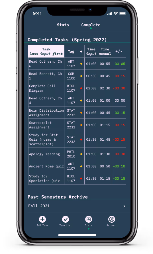
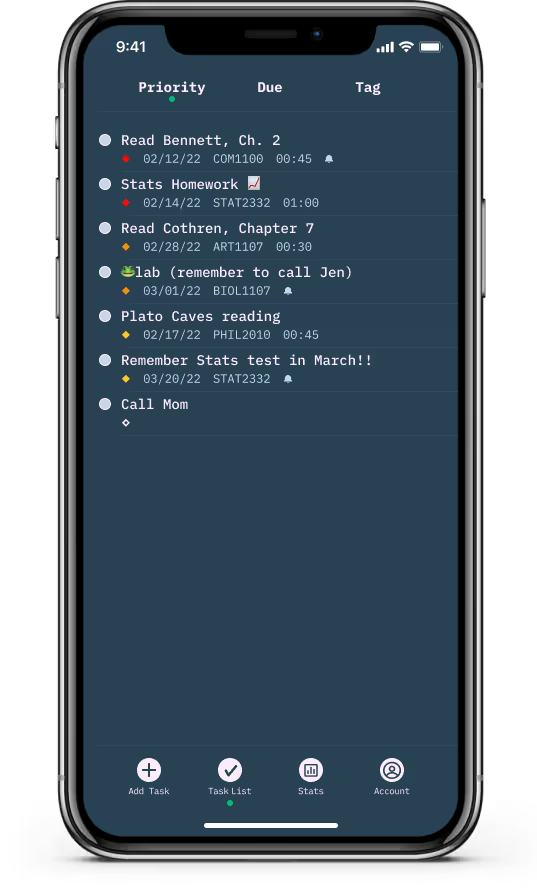
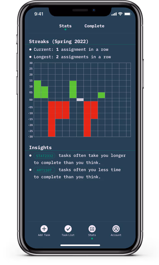
Opus encourages realistic assessments of time to complete tasks for college students. This is accomplished through Streaks (a feature that encourages correct estimations of time), a statistical dashboard to monitor progress over time, and notifications.You can view the full case study at the link below.
content design
info arch
interaction design
ui design
user design
figma
illustrator
miro
microsoft teams
google meet
discord
- Create a “by way of example" to show undergraduate students in a design class how to create a prototype using an interaction design method while taking a class online during the Covid-19 pandemic.
- Design something that connects user goals, business goals, and aesthetic implementation.
- To better understand productivity and organizing in college, I completed an analysis of relevant context, including: the current discourse on time management and current productivity practices in the college.
- Interviewed 8 undergraduates in public schools in the state of Georgia to better understand their practices and needs.
- To get a fuller understand of the work done, you may visit the project whiteboard file↗︎ or read the research report↗︎.
- Used stakeholder roleplaying and research add business constraints to user goals.
- Paired an extensive lit review with potential user interviews to understand the challenges of sizing tasks for undergrad students.
- Completed a full re-design of the app based on usability feedback. This was to address information layout issues as well as a design for dark screens.
Opus Task List - First Iteration
Opus Task List - Second Iteration
- Created an onboarding experience as a response to user feedback to orient them to the possibilities of Opus.
- I did all of this work myself and it was a lot. These methods are team-based for a reason.
- I designed Opus on a relative 8-point grid↗︎. Using a standardized spatial system helped with decision fatigue and created an orderly design. To implement this, I utilized a variant set of spacer/measurer elements.
- I still feel uneasy about the placement of the “add task" icon in the tab bar. I feel like, with more iterations, placement might change.
- The 8 participants interviewed in the Research Phase were not the ideal participant pool because many highly organized students have opinions on organization and were attracted to the Reddit post. With more time and resources, it would have been better to target more students who were less articulate and/or experienced regarding organization strategies.