A mobile app imagined as a partnership with the estate of modernist designer Paul Rand.
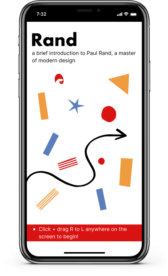
main Screen
Rand introduces new users to Paul Rand, a famous modernist designer. In addition to a brief introduction to his life and design philosophies, the prototype includes 4 case studies emblematic of his oeuvre.
This prototype is my “take” on a project given to undergrad students in a class that introduced them to fundamental visual and user interface terminology to be applied to a prototype-based project.
The project prompt asked students to create a website or mobile app prototype that would act as an introduction to Paul Rand to those unfamiliar with his work. The hypothetical client was the estate of Paul Rand. The goal of the project was to create a working prototype and explain their decision-making process.
For context, students read Paul Rand’s Thoughts on Design (1947), listened to lectures on modernism, read chapters on pictorial modernism, the International Typographic Style, and the New York School from Philip B. Meggs & Alston W. Purvis’ Meggs’ History of Graphic Design (2012), and were encouraged to do extra research on Paul Rand.
In the following sections, I'll walk you through how the project was conceptualized, my approach to design, and lessons I learned along the way.
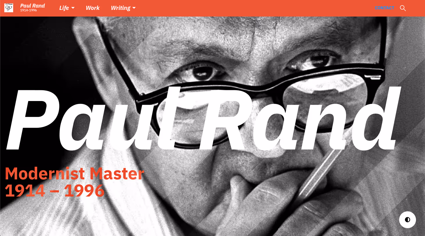
paulrand.design Website
I wanted to create an app that acted as a funnel to the paulrand.design↗︎ website. On that site, we find a comprehensive archive of Rand’s life, work, and writings.
In a bid to attract new audiences to Rand's work, a “mobile-first approach” made sense because, according to Pew Research, “Americans of all ages are increasingly likely to say they mostly go online using their smartphone" (2019, 1). Additionally, the younger a person is, the more likely it is that a smartphone will be their primary access point for the internet.
Considering these facts, this prototype aims to create an appealing, introductory experience for people unfamiliar with Rand's work and act as a funnel to a more complex experience on the web. In doing so, the app prototype favors quick engagement and curiosity, while still creating some sense of depth through the implementation of case studies that cover all of Rand’s major design areas — advertisements, book and magazine covers, and logo design.
The design of the app was based on Paul Rand's belief that beauty and usefulness were mutually generative. The app aimed for beauty based on an homage to some of his stylistic techniques, many of them articulated in Rand's book Thoughts on Design (1947). The app aimed for utility based on the simplicity inherent in Steve Krug’s approach to web and mobile usability. In the next two sections, I will explain these approaches.
Paul Rand was enamored with the modern art emanating from Europe in the late 19th & early 20th centuries. And he was seen as one of the first graphic designers to popularize a modern style in an American context. Even so, his style never fit neatly into theories of European modern design. At its most constrictive, a modern design philosophy eschewed “personal expression and eccentric solutions were rejected, while a more universal and scientific approach to design problem solving was embraced” (Meggs & Purvis, 2012, 372).
Rand's design philosophy balanced a tension between the geometry of European graphic modernism and human playfulness; or, as Philip B. Meggs put it, the use of “sensual visual contrasts" (2012, 391). Overall, as Ned Drew and Paul Sternberge identify, Rand’s style might often be described as “informal playfulness" (2005, 63).
The design for the Rand app embodies this tension between a stricter European modernism and Rand's creatively playful interpretation. For instance, I worked within many guidelines of modernist graphic design, which included the use of grids, geometric abstraction, sans-serif typefaces, et cetera. In many ways, the “clarity and order” of modern design shouldn’t be difficult to approximate since most contemporary app design is grid-based and works with geometric shapes to create the condition for responsive designs.

Onboarding GIF
You can see an incorporation of Rand's whimsical, hand drawn style in the introductory onboarding process for the app (see Onboarding GIF). I did this through an homage to common Rand techniques—the whimsical placement of organic geometric shapes and undulating arrows as part of collages. These collages offer the “in-process” feel that trouble the otherwise orderly nature of the app. Rand often favored the way collages created active moments of synthesis for audiences (2014, 48).
I employed a modernist design tendency to use sans-serif fonts for their machine-like appearance. I used fonts from two sans-serif font families in this app—Futura and Inter. Futura Bold was used for titles and nav bars because, as Paul Rand says, Futura is “unique” and not recommended for large portions of text (Rampone, 1989, 1).
Additionally, vibrant colors were used to pique attention and “pop” against the primary black and white color scheme of the app. These colors were drawn from the color palettes of the 4 case studies:
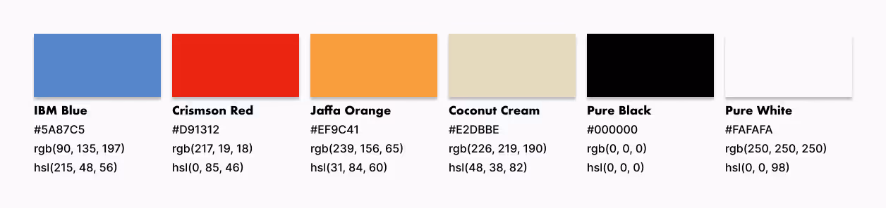
App Color Styles
Further discussion of font and color usage will appear in the next section. Through the application of modern principles and an aesthetic that pays homage to Paul Rand, I created something beautiful within the context of his work.
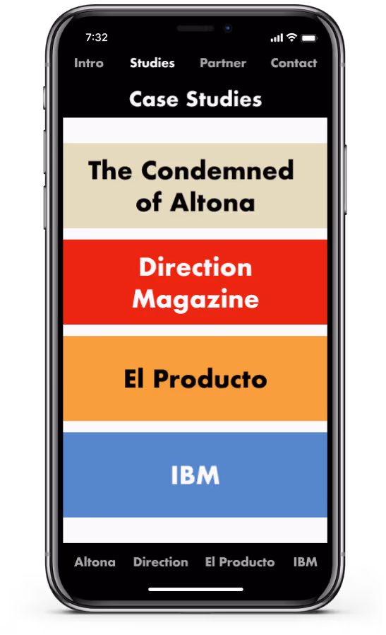
Case Studies
While Rand believed that design should be beautiful, he also thought that it needed to be in the “service of communication" (2014, 9). The prompt for this project asked students to not only explain their design decisions in light of Paul Rand’s thoughts on design, but also by the “rules of thumb” for good web and mobile design that Steve Krug laid out in Don’t Make Me Think, Revisited (2014). Krug's work is an introduction to concepts that live under the umbrella of information architecture.
The app was designed to be usable in, as Krug would say, self-evident rather than self-explanatory ways. I designed the prototype for an iPhone X viewport (375 x 812), followed basic UI design principles, and worked with suggestions from the then current iOS Human Interface Guidelines↗︎.
Rand is made easily usable through (1) conventions I followed and (2) the organizational strategies for accommodating findability and shaping user flow.:
Case Studies organized by hierarchy & color
The app was organized around the following concepts:
Through the application of Krug’s “rules of thumb” for mobile usability, I created something that is useful without compromising the beauty of Rand’s work.
We see a tension between beauty and usefulness that plays itself out through Paul Rand’s career. His goal was to be beautiful in such a way that it served a purpose in communicating ideas. Yet, Rand also believed that we should not overemphasize function at the expense of style (2014, 76). This is the tightrope we always walk as designers if we are to not only make beauty and usefulness mutually generative, but to satisfy our own aesthetic standards in the process. In this app, I created a successful homage to Paul Rand that does not eliminate his aesthetic playfulness for the sake of usability.
Drew, Ned & Paul Sternberge. 2005. By Its Cover: Modern American Book Cover Design. Princeton: Princeton Architectural Press.
Inter Typeface Family. Accessed May 1, 2019. (link↗︎)
Krug, Steve. 2014. Don't Make Me Think Revised 3rd Edition. Indianapolis: New Riders.
Meggs, Philip B. & Alston W. Purvis. 2012. Meggs’ History of Graphic Design 5th edition. Hoboken: Wiley.
Pew Research Center. “Mobile Technology and Home Broadband." Accessed May 1, 2019. (link↗︎)
Rampone, Mario. 1989. “Paul Rand Interview.” Fall 1989, New Series, Volume 1, No. 1.
Rand, Paul. 2014. Thoughts on Design: New Edition. New York: Chronicle Books.